1 What is a Dowsing Chart?
A dowsing chart is a visual tool used alongside a pendulum to obtain answers from the subconscious or energetic field. It typically consists of a central point and radiating sections or concentric rings containing labels, numbers, or symbols.
By holding a pendulum over the center, the practitioner observes the direction of its swing to determine which section is being indicated. Custom charts are powerful because they focus intention on a specific topic — from health and emotions to choosing the right crystal or essential oil. In the Studio, you build these as layers (rings) with live preview, themes, and precision typography.
Charts render 100% in your browser (HTML5 Canvas). Nothing leaves your device unless you explicitly choose to share a link. Your labels stay on your device, with auto-save to localStorage so you can resume later.
2 Planning Your Chart
Two minutes of planning saves ten minutes of tweaking. Use this checklist before you open the Studio.
| separator to add a stacked sub-label (e.g., Joy | cheerful mood). You can toggle sub-label visibility globally and fine-tune scale/opacity in Settings.Readability Tip: Over ~30 items per ring forces tiny fonts. Split crowded sets into two layers or two charts. See Typography Guide for safe sizes.
Half-Circle (180°): Excellent for binary/scale choices (Yes/No, 0–100%) with wider slices.
Radial Burst: Sunburst with center pendulum zone and radiating lines — ideal for energy work and presentation. Adjust Arc Width and Inner Radius in the Theme tab to fine-tune. Its settings let labels run along the line or as horizontal callouts, tint the wedges, and alternate long and short leaders.
Spoke Wheel: One spoke per label, with text running outward beyond the rim, so slice width never limits the text. Best for 20–40+ labels. Layers are joined into one clockwise sequence; use Spoke Length, Auto-fit, Tinted wedges, End dots, Equal Font and Layer gap to tune it.
Petal Flower: Each label sits in an overlapping petal and every layer is a concentric row, like a lotus. Tune Petal Overlap, Petal Shape (rounded or pointed), Stagger alternate layers, Centre hub and Equal font size per layer.
Tip: Press
L to cycle through all five layouts. Layout settings appear under Chart Type as soon as you pick one, and are kept on undo/redo, JSON export and Clear All.
3 Step-by-Step Studio Tutorial
The Studio has four tabs: Content, Theme, Text, Settings. You can build a complete chart without leaving the canvas.
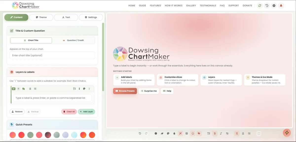
1 Set your intent — Title + Credit
In Content → Chart Title, enter a descriptive title (anchors the session). Add a Custom Credit / Question for attribution or a left-aligned prompt (e.g., "What is my next step?"). Tip: click the title directly on the canvas to edit its size and color.
2 Build layers (up to 4 rings)
Click Add Layer to create concentric rings. Each ring has its own name, height weight, background, and theme override. Use arrows to reorder; hide/lock icons to protect structure while editing.
3 Populate & style labels
Type labels or paste comma-separated lists. Use Label | Sub-label to stack hints. Click the Pencil on any tag to override font color, bold/italic, wrap, orientation, or slice background — per label, without affecting the global theme.
4 Click-to-edit on canvas
Click any label or the title directly on the preview to open its style editor. It's the fastest way to polish: change one slice, see it live, undo with Ctrl+Z.
5 Apply presets instantly
Short on time? Open All Presets (600+ sets: Chakras, Planets, Emotions, Numbers, etc.), search by keyword, bookmark favourites, and apply to the selected or first empty layer. Use Feeling Lucky () or per-layer random themes for variety.
6 Drag-to-reorder on canvas
Grab a label on the chart and drag it to a new angle within the same ring, or to a different ring. Visual drop zones and tooltips confirm the target. Sidebar tag bubbles support the same drag. With Smart Scale off, drag ring boundaries to resize layer heights.
7 Tune Theme, Text & Settings
Theme tab: Chart Type, Arc Width, Inner Radius, 80+ color themes, Randomize Colors, Chart Opacity, Eco Mode, Slice Gradient, Smart Scale Rings, and a full border toolkit — border color & width, six line styles (Solid / Dashed / Dotted / Dash-dot / Long-dash / Custom dash & gap), a double line, plus ring-border, divider-line and divider-strength controls. Text tab: 50+ fonts, size, color, bold/italic/uppercase, orientation, position. Settings tab: Emojis, sub-label visibility/scale/opacity, Auto Label Contrast, Label Autocomplete, Hover Highlight, Smooth Transitions, Layer Weight Mode, live update, auto-preset title, wrap controls, and comma input.
Auto-save writes every change to dcm_last_project in your browser. Close the tab and return later — you'll be offered to resume, and the Recent Charts gallery keeps your last session plus the last nine exports (pin or delete any you like). Use Backup (Ctrl+B) for a JSON snapshot and Restore to bring it back. X clears everything — press Enter to confirm the dialog.
Ctrl + Z / Y— Undo / Redo (50-step history)Alt + N— Add new layerD— Full Screen Viewer (pan & zoom)X— Clear chart / start fresh (pressEnterto confirm)F1— Help & Shortcuts overlayCtrl + B— Backup JSONCtrl + Q— Randomize themeCtrl + F5— Hard refresh (fix errors)E/S— Toggle emojis / sub-labelsB/I/U/W— Bold / italic / uppercase / text wrapG/L/O/P— Cycle gradient / layout / orientation / positionF/K/A/T— Font size / border width / opacity / themeH— Label glow (soft halo behind label text)Shift + E— Eco Mode (ink saver)1/2/3/4— Content / Theme / Text / Settings panel tab5— Open the Preset Library
4 Advanced Design
Well-structured visuals give clearer answers. These Studio features help you guide the eye and the pendulum.
Visual Energy & Logic
- Per-layer themes: Give each ring its own palette to separate categories (e.g., outer: Emotions, inner: Timeline). Clear all overrides with one click or randomize per-layer themes.
- Slice Gradient & Chart Opacity: Toggle subtle gradients and translucency for depth without hurting print clarity.
- Smart Scale Rings: Auto-balances ring heights for legibility; disable for manual drag-to-resize.
- Emojis & Symbols: Add visual anchors the subconscious reads fast; toggle globally in Settings.
- Right-click quick actions: Right-click a layer or label for instant menus — move, lock, sort, duplicate, copy/paste style, and Highlight Slice swatches (Yes/Sage, Caution/Gold, No/Ruby, Spiritual/Amethyst, and more) to colour-code answers.
- Readability helpers: Auto Label Contrast keeps text legible on any slice, while Hover Highlight and Smooth Transitions make on-screen reading calmer.
- Eco-Mode (Ink Saver): One-click high-contrast B/W for economical bulk printing.
Learn the "Dowsing Funnel," color theory for themes, layout choice, and typography thresholds. Works for both screen dowsing and laminated print.
Read Advanced Design Guide5 The Bulk Engine
Create dozens or hundreds of charts from a single data file — perfect for client sets, research, or themed collections. Supports CSV / TSV / XLSX with auto-delimiter detection and an interactive table editor.
- Upload or paste: Drag an Excel file or paste delimited text.
- Preview & edit: Fix cells inline, search/find & replace, choose presets per column, and brand every chart with your own logo.
- Export ZIP: Render all charts offscreen and download a dated ZIP — PNG, JPEG, PDF or vector SVG.
- Booklet or cards: Combine the whole batch into a single multi-page PDF, or keep individual files.
- AI Helper: Generate structured rows with a one-click prompt for ChatGPT/Gemini.
Delimiter rules, overrides, preview tips, and ZIP export steps are covered in detail.
Read Bulk Engine Guide6 Full Screen Viewer
Designed for active dowsing on screen. Press D (or click the Fullscreen icon) to hide toolbars and focus on the chart alone.
- Pan & Zoom: Mouse wheel or pinch-to-zoom; drag to pan. Great for dense, multi-layer charts.
- Batch navigation: When using Bulk Engine, cycle through the entire batch with on-screen arrows without exiting.
- Distraction-free: Center crosshair stays visible to anchor the pendulum.
If you dowse digitally, set Chart Opacity around 0.7 and use a high-contrast theme (e.g., Midnight, Deep Space). For print, keep background white (paper does the work).
7 Expert Tips & Tricks
Canvas drag-to-reorder
Don't hunt the sidebar — grab a label on the chart. Coral drop zones highlight the target ring; snap-to-angle keeps spacing precise. Tooltip confirms the destination layer name.
Layer height on canvas
Turn Smart Scale Rings off, then drag ring boundaries directly. Perfect for giving priority rings more space without editing text.
Command center (F1)
Opens the Help & Shortcuts hub with every hotkey, quick tips, and support links. Also accessible from the navbar and by pressing /.
Share a chart or a QR code
Hit Share to generate a short link (and a scannable QR code) for your exact chart — no account needed. Recipients open a clean read-only viewer with a one-tap Edit Chart button to make their own copy, plus a Download menu (JSON / PNG / JPEG / PDF / SVG). Links can expire or be removed, in which case visitors land on a friendly recovery page; long-term links embed the whole chart in the URL itself.
Widen a label with Slice Span
Right-click any label on the chart and open Slice Span to spread it across 1–5 adjacent slices. Perfect for giving one answer more weight or grouping a short range into a single band — the surrounding labels reflow automatically.
Frame the chart with border styles
In the Theme tab, choose from six border styles — Solid, Dashed, Dotted, Dash-dot, Long-dash or a Custom dash you set yourself — then refine the look with Double Line, Ring Borders, Divider Lines and the Divider Strength slider. Every style renders in exports too.
Add a QR code to a printed chart
In the Export menu, flip the QR toggle on to stamp a scannable code (with a "Scan to edit" caption) into the top-right corner. Scan it to reopen the chart on any phone — ideal for laminated charts, handouts and client packs. It re-renders automatically to match the latest design.
Per-label emphasis
Bold/italic only the critical slices, or tint one slice's background to draw focus. Clear overrides instantly from the modal if you change direction.
8 Printing & Exporting
Export is done on an offscreen high-density canvas, so small labels stay crisp even at poster size.
| Format | Best for | Notes |
|---|---|---|
| Print (A4/Letter, laminated) | High-resolution, print-ready capture Print best | |
| SVG | Design rescaling & pro print | True vector — infinite zoom, embeds fonts Lossless |
| PNG | Digital & layered design | Supports transparency — overlay on photos/textures Transparent |
| JPEG | Quick share, email | White background, smaller file |
| JSON (Project) | Backup / re-import | Full editable project via Backup |
| ZIP (Bulk) | Batches of charts | One dated ZIP from Bulk Engine |
High-resolution mastery
Exports render at 4K UHD (3840×2160) on a dedicated buffer (not a screenshot). That clears the ~3500px a standard A4 at 300 DPI needs, with margin to spare, and stays crisp for A3. PNG keeps transparency for Canva/Photoshop layering, while SVG is true vector — scale it to any size with no loss.
Frequent printer? Enable Eco-Mode in Theme or Quick Presets before exporting. It forces high-contrast B/W, saving ink while keeping lines sharp.
9 Using Your Chart
Once exported or in Full Screen Viewer, use a consistent routine for clearer signals.
- Establish Yes/No: Ask the pendulum to show a clear Yes swing and a clear No swing before your main question.
- Center: Hover exactly over the center crosshair/pendulum zone.
- State intent: Visualize or speak the question while viewing the labels.
- Observe the lead: Allow a free swing; the direction it consistently favors indicates the answer. For multi-layer charts, read outer → inner as a funnel.
Charts improve with use. If a response feels vague, split an overloaded ring into two layers or two charts, bump font size, or increase Arc Width for wider slices. Save each iteration with Backup to compare.